Appearance
全屏布局
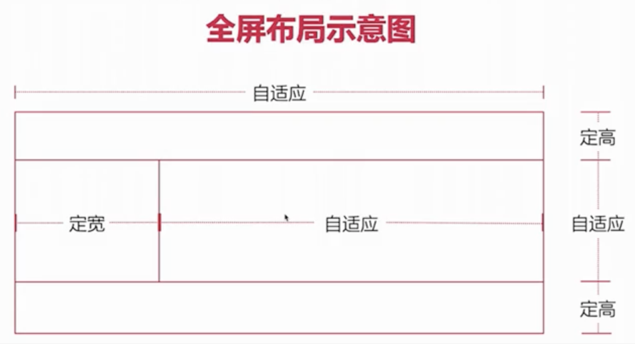
含义:全屏布局就是指 HTML 页面铺满整个浏览器窗口,并且没有滚动条。而且还可以跟着浏览器的大小变化而变化;
html
<!--
头部和底部 定稿
中间 - 左右 左定宽  右边自适应
全屏 - 不能出现滚动条 - 串口进行缩放
-->
<header></header>
<div class="content">
  <div class="left"></div>
  <div class="right"></div>
</div>
<footer></footer>
1
2
3
4
5
6
7
8
9
10
11
2
3
4
5
6
7
8
9
10
11
css
* {
  margin: 0;
  padding: 0;
}

header {
  height: 100px;
  background-color: lightgray;
  /* 固定头部 - 定位元素的宽度本身内容的属性 */
  position: fixed;
  top: 0;
  /* 宽度撑开 - width:100% */
  left: 0;
  right: 0;
}

.content {
  background-color: lightblue;
  /* 高度撑开 */
  position: fixed;
  top: 100px;
  bottom: 100px;
  left: 0;
  right: 0;
  /* 隐藏 - atuo overflow-x overflow-y */
  overflow-y: scroll;
}

.content .left {
  width: 300px;
  height: 100%;
  background-color: lightcoral;
  /* 定宽 300 */
  position: fixed;
  top: 100px;
  bottom: 100px;
  left: 0;
}

.content .right {
  height: 10000px;
  background-color: greenyellow;
  /* 自适应 */
  position: fixed;
  /* 宽度撑开 */
  left: 300px;
  right: 0;
  /* 高度撑开 */
  top: 100px;
  bottom: 100px;
}

footer {
  height: 100px;
  background-color: lightslategray;
  position: fixed;
  bottom: 0;
  /* 宽度撑开 - width:100% */
  left: 0;
  right: 0;
}
1
2
3
4
5
6
7
8
9
10
11
12
13
14
15
16
17
18
19
20
21
22
23
24
25
26
27
28
29
30
31
32
33
34
35
36
37
38
39
40
41
42
43
44
45
46
47
48
49
50
51
52
53
54
55
56
57
58
59
60
61
2
3
4
5
6
7
8
9
10
11
12
13
14
15
16
17
18
19
20
21
22
23
24
25
26
27
28
29
30
31
32
33
34
35
36
37
38
39
40
41
42
43
44
45
46
47
48
49
50
51
52
53
54
55
56
57
58
59
60
61