Appearance
两列布局
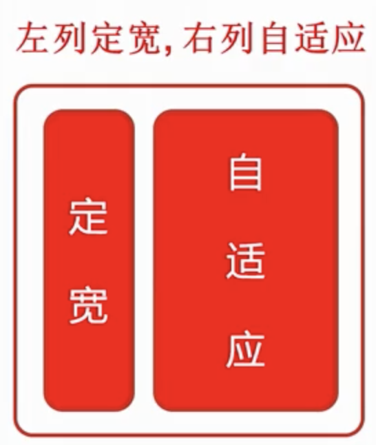
含义:两列布局一 - 般情况下是指定宽与自适应布局,两列中左列是确定的宽度,右列是自动填满剩余所有空间的一种布局效果;
布局介绍
| 图片 | 实现 |
|---|---|
 | - 利用 float + margin 实现; - 利用 float + margin(fix) 实现; - 利用 float + overflow 实现; - 使用 table + table-cell 实现; - 使用 position 绝对定位实现; - 使用 flex 属性实现; - 使用 Grid 属性实现; |
方法一 float + margin(fix) 实现
左浮动 右浮动 右不浮动 - 自适应容器 - 子元素 clear:both
html
<div id="left"></div>
<!-- 为自适应元素定位父级元素 -->
<div id="right-fix">
  <div id="right">
    <div id="inner"></div>
  </div>
</div>
1
2
3
4
5
6
7
2
3
4
5
6
7
css
#left {
  width: 400px;
  height: 300px;
  background-color: #c9394a;
  float: left;
  position: relative;
}
#right-fix {
  float: right;
  width: 100%;
  margin-left: -400px;
}
#right {
  margin-left: 420px;
  height: 400px;
  background-color: #ccc;
}
#inner {
  background-color: green;
  height: 300px;
  clear: both;
}
1
2
3
4
5
6
7
8
9
10
11
12
13
14
15
16
17
18
19
20
21
22
2
3
4
5
6
7
8
9
10
11
12
13
14
15
16
17
18
19
20
21
22
方法二 利用 float + overflow 实现
html
<div id="left"></div>
<!-- 为自适应元素定位父级元素 -->
<div id="right">
  <div id="inner"></div>
</div>
1
2
3
4
5
2
3
4
5
css
* {
  margin: 0;
  padding: 0;
}
#left {
  width: 400px;
  height: 300px;
  background-color: #c9394a;
  float: left;
}
#right {
  height: 400px;
  background-color: #ccc;
  /* BFC - 形成一个隔离容器 - 条件之一 */
  overflow: hidden;
}
#inner {
  background-color: green;
  height: 300px;
  clear: both;
}
1
2
3
4
5
6
7
8
9
10
11
12
13
14
15
16
17
18
19
20
21
2
3
4
5
6
7
8
9
10
11
12
13
14
15
16
17
18
19
20
21
方法三 table+table-cell
html
<div id="parent">
  <div id="left"></div>
  <!-- 为自适应元素定位父级元素 -->
  <div id="right">
    <div id="inner"></div>
  </div>
</div>
1
2
3
4
5
6
7
2
3
4
5
6
7
css
* {
  margin: 0;
  padding: 0;
}
#parent {
  width: 100%;
  height: 400px;
  display: table;
}
#left {
  display: table-cell;
  width: 400px;
  height: 300px;
  background-color: #c9394a;
}
#right {
  display: table-cell;
  height: 400px;
  background-color: #ccc;
}
1
2
3
4
5
6
7
8
9
10
11
12
13
14
15
16
17
18
19
20
2
3
4
5
6
7
8
9
10
11
12
13
14
15
16
17
18
19
20
方法四 flex
html
<div id="parent">
  <div id="left"></div>
  <!-- 为自适应元素定位父级元素 -->
  <div id="right">
    <div id="inner"></div>
  </div>
</div>
1
2
3
4
5
6
7
2
3
4
5
6
7
css
* {
  margin: 0;
  padding: 0;
}
#parent {
  width: 100%;
  height: 500px;
  display: flex;
}
#left {
  width: 400px;
  height: 400px;
  background-color: #c9394a;
}
#right {
  /* 100% - 400 */
  flex: 1;
  height: 500px;
  background-color: #ccc;
}
1
2
3
4
5
6
7
8
9
10
11
12
13
14
15
16
17
18
19
20
2
3
4
5
6
7
8
9
10
11
12
13
14
15
16
17
18
19
20
方法五 position 绝对定位实现
css
* {
  margin: 0;
  padding: 0;
}
#parent {
  position: relative;
}
#left {
  width: 400px;
  height: 400px;
  background-color: #c9394a;
  position: absolute;
  top: 0;
  left: 0;
}
#right {
  height: 400px;
  background-color: #ccc;
  position: absolute;
  left: 400px;
  right: 0;
  top: 0;
}
1
2
3
4
5
6
7
8
9
10
11
12
13
14
15
16
17
18
19
20
21
22
23
2
3
4
5
6
7
8
9
10
11
12
13
14
15
16
17
18
19
20
21
22
23
html
<div id="parent">
  <div id="left"></div>
  <!-- 为自适应元素定位父级元素 -->
  <div id="right">
    <div id="inner"></div>
  </div>
</div>
1
2
3
4
5
6
7
2
3
4
5
6
7
方法六 Grid
css
* {
  margin: 0;
  padding: 0;
}
#parent {
  width: 100%;
  height: 500px;
  /* 网格布局 */
  display: grid;
  /* 每个列的宽度 左 - 400px 右 - 自适应 */
  grid-template-columns: 400px auto;
}
#left {
  height: 400px;
  background-color: #c9394a;
}
#right {
  height: 500px;
  background-color: #ccc;
}
1
2
3
4
5
6
7
8
9
10
11
12
13
14
15
16
17
18
19
20
2
3
4
5
6
7
8
9
10
11
12
13
14
15
16
17
18
19
20