Appearance
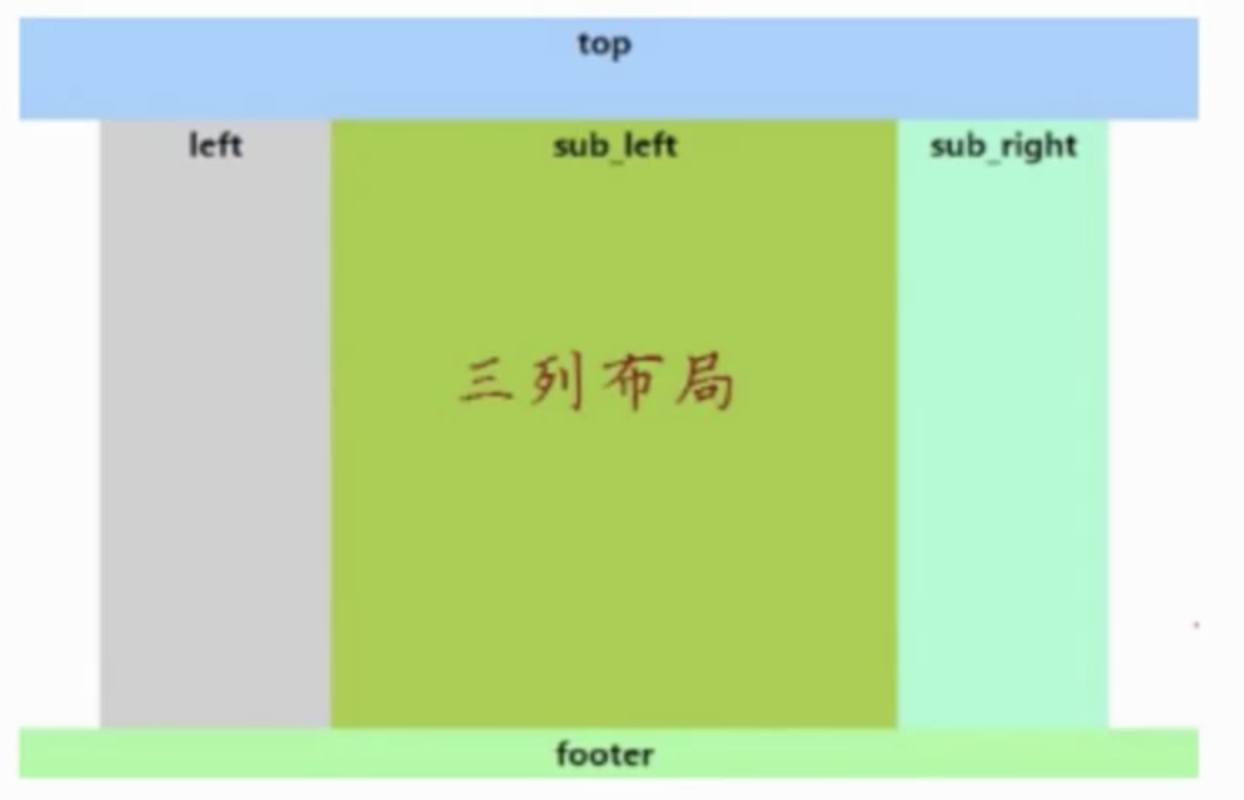
三列布局
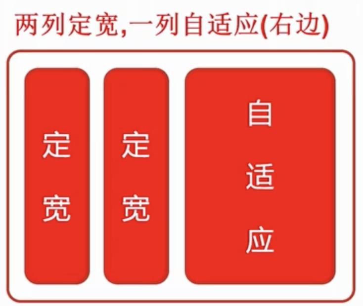
左右定宽
含义:三列布局一 - 般情况下是指三列中左边两列是确定的宽度,右边一 - 列是自动填满剩余所有空间的一种布局效果;
| 图片 | 实现 |
|---|---|
 | - float + margin - float + overflow - table + table-cell - flex 属性实现 - Grid 属性实现 |
方法一 float + margin
html
<div id="left"></div>
<div id="center"></div>
<div id="right"></div>
1
2
3
2
3
css
* {
  margin: 0;
  padding: 0;
}
#left {
  width: 200px;
  height: 300px;
  background-color: #c9394a;
  float: left;
}
#center {
  width: 200px;
  height: 300px;
  background-color: green;
  float: left;
}
#right {
  height: 400px;
  background-color: #ccc;
  margin-left: 400px;
}
1
2
3
4
5
6
7
8
9
10
11
12
13
14
15
16
17
18
19
20
21
2
3
4
5
6
7
8
9
10
11
12
13
14
15
16
17
18
19
20
21
方法二 float + overflow
html
<div id="left"></div>
<div id="center"></div>
<div id="right"></div>
1
2
3
2
3
css
* {
  margin: 0;
  padding: 0;
}
#left {
  width: 200px;
  height: 300px;
  background-color: #c9394a;
  float: left;
}
#center {
  width: 200px;
  height: 300px;
  background-color: green;
  float: left;
}
#right {
  overflow: hidden;
  height: 400px;
  background-color: #ccc;
}
1
2
3
4
5
6
7
8
9
10
11
12
13
14
15
16
17
18
19
20
21
2
3
4
5
6
7
8
9
10
11
12
13
14
15
16
17
18
19
20
21
方法三 table + table-cell
html
<div id="parent">
  <div id="left"></div>
  <div id="center"></div>
  <div id="right"></div>
</div>
1
2
3
4
5
2
3
4
5
css
* {
  margin: 0;
  padding: 0;
}
#parent {
  width: 100%;
  display: table;
}
#left {
  display: table-cell;
  width: 200px;
  height: 300px;
  background-color: #c9394a;
}
#center {
  display: table-cell;
  width: 200px;
  height: 300px;
  background-color: green;
}
#right {
  display: table-cell;
  height: 400px;
  background-color: #ccc;
}
1
2
3
4
5
6
7
8
9
10
11
12
13
14
15
16
17
18
19
20
21
22
23
24
25
2
3
4
5
6
7
8
9
10
11
12
13
14
15
16
17
18
19
20
21
22
23
24
25
方法四 Grid
html
<div id="parent">
  <div id="left"></div>
  <div id="center"></div>
  <div id="right"></div>
</div>
1
2
3
4
5
2
3
4
5
css
* {
  margin: 0;
  padding: 0;
}
#parent {
  width: 100%;
  display: grid;
  grid-template-columns: 200px 200px auto;
}
#left {
  width: 200px;
  height: 300px;
  background-color: #c9394a;
}
#center {
  width: 200px;
  height: 300px;
  background-color: green;
}
#right {
  height: 400px;
  background-color: #ccc;
}
1
2
3
4
5
6
7
8
9
10
11
12
13
14
15
16
17
18
19
20
21
22
23
2
3
4
5
6
7
8
9
10
11
12
13
14
15
16
17
18
19
20
21
22
23
方法五 flex
html
<div id="parent">
  <div id="left"></div>
  <div id="center"></div>
  <div id="right"></div>
</div>
1
2
3
4
5
2
3
4
5
css
* {
  margin: 0;
  padding: 0;
}
#parent {
  width: 100%;
  display: flex;
}
#left {
  width: 200px;
  height: 300px;
  background-color: #c9394a;
}
#center {
  width: 200px;
  height: 300px;
  background-color: green;
}
#right {
  flex: 1;
  height: 400px;
  background-color: #ccc;
}
1
2
3
4
5
6
7
8
9
10
11
12
13
14
15
16
17
18
19
20
21
22
23
2
3
4
5
6
7
8
9
10
11
12
13
14
15
16
17
18
19
20
21
22
23
圣杯布局
| 图片 | 实现 |
|---|---|
 | - 圣杯布局方法 - 双飞翼布局方法 - 使用 Gird 实现 - 使用 table 实现 - 使用 flex 实现 - 使用 position 实现 |
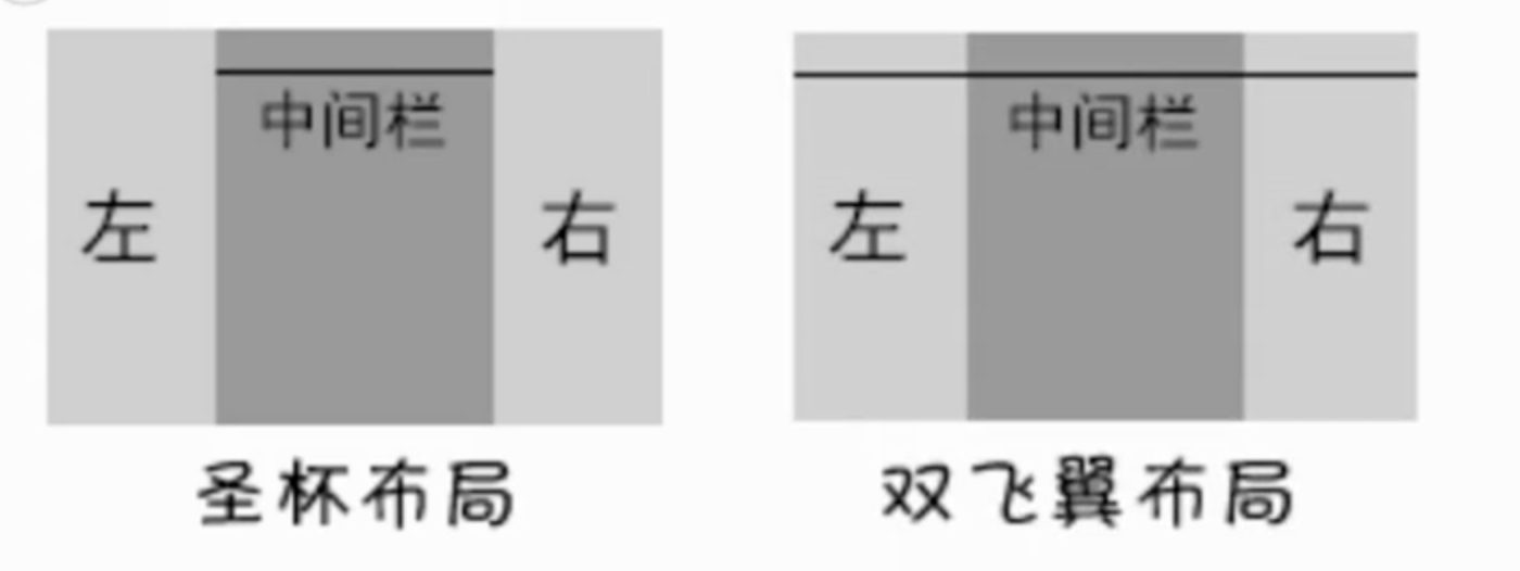
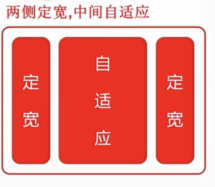
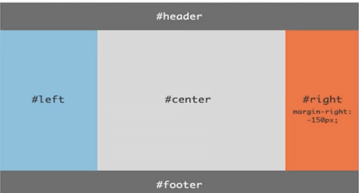
圣杯布局是来源于该布局效果类似圣杯而得名。简单来说,就是指三行三列布局; 圣杯布局核心:主要是实现中间主体部分中的左右定宽 + 中间自适应的布局效果;
html
<!-- 三列布局 - 左右定宽  中间自适应 -->
<div id="parent">
  <div id="center"></div>
  <div id="left"></div>
  <div id="right"></div>
</div>
1
2
3
4
5
6
2
3
4
5
6
css
* {
  margin: 0;
  padding: 0;
}

#parent {
  height: 300px;
  /* 第二步 给left和right容器间距放得下 */
  padding: 0px 310px;
}

#left,
#center,
#right {
  height: 300px;
  /* 第一步: 三个容器横向排列 float => 已经在一行=> width: 100%;
  => left和right没有剩余空间 所以掉下去啦*/
  float: left;
}

#left,
#right {
  width: 300px;
}

#left {
  background-color: #c9394a;
  /* 第三步:把left移动到原本的位置 */
  margin-left: -100%;
  /* 把left移动在理想的位置 => 定位 relative 作用 让left生效*/
  position: relative;
  left: -310px;
}

#center {
  width: 100%;
  background-color: green;
}

#right {
  background-color: #ccc;
  /* 第三步:把left移动到原本的位置 => right应该是在center的后面 */
  margin-left: -300px;
  position: relative;
  right: -310px;
}
1
2
3
4
5
6
7
8
9
10
11
12
13
14
15
16
17
18
19
20
21
22
23
24
25
26
27
28
29
30
31
32
33
34
35
36
37
38
39
40
41
42
43
44
45
46
2
3
4
5
6
7
8
9
10
11
12
13
14
15
16
17
18
19
20
21
22
23
24
25
26
27
28
29
30
31
32
33
34
35
36
37
38
39
40
41
42
43
44
45
46
双飞翼布局
- 双飞翼布局最早是淘宝团队提出,是针对圣杯布局的优化解决方案。
- 主要是优化了圣杯布局中开启定位的问题。

html
<!--
在圣杯基础的结构的基础上 => 中间容器里面嵌套了一个子容器
双飞翼 没有定位进行位置的移动
-->
<div id="parent">
  <div id="center">
    <div id="inner"></div>
  </div>
  <div id="left"></div>
  <div id="right"></div>
</div>
1
2
3
4
5
6
7
8
9
10
11
2
3
4
5
6
7
8
9
10
11
css
* {
  margin: 0;
  padding: 0;
}
#parent {
  height: 300px;
}

#left,
#right,
#center {
  height: 300px;
  /* 第一步:让三个列横向排列 => float 三个列显示在一行
  我们看不在一行=> center 100% 挤下去
  */
  float: left;
}

#left,
#right {
  width: 300px;
}

#left {
  background-color: #c9394a;
  /* 第三步: 位置的移动 => 移动到她本地的位置 */
  margin-left: -100%;
}

#center {
  width: 100%;
  background-color: green;
  /* 第二步: 把center进行挤压 */
}

#right {
  background: #ccc;
  margin-left: -300px;
}

#inner {
  height: 300px;
  background-color: hotpink;
  /* 留给left、right容器 留出空间 */
  margin: 0 310px;
}
1
2
3
4
5
6
7
8
9
10
11
12
13
14
15
16
17
18
19
20
21
22
23
24
25
26
27
28
29
30
31
32
33
34
35
36
37
38
39
40
41
42
43
44
45
46
2
3
4
5
6
7
8
9
10
11
12
13
14
15
16
17
18
19
20
21
22
23
24
25
26
27
28
29
30
31
32
33
34
35
36
37
38
39
40
41
42
43
44
45
46
左右留白

圣杯左右留白 - parent : padding-left  padding-right
双飞翼留白 - center的子元索inner身上   margin-left margin-right

圣杯布局移动 - margin负值进行移动 + position+left 方位
双飞翼 - margin负值进行移动

三列布局(常规)
left center right

圣杯 和 双飞翼 center left right => 布局技巧parent
1
2
3
4
5
6
7
8
9
10
11
12
2
3
4
5
6
7
8
9
10
11
12